10 v0.dev Prompts That Actually Produce Good Landing Pages (2026 Edition)
The exact v0.dev prompt structures that produce usable landing pages on the first or second try, with copy-paste examples for SaaS, dev tools, AI products, marketplaces, and more. Tactical, no fluff.
v0.dev produces excellent landing pages when you prompt it like a designer with a brief, and slop when you prompt it like a developer with a feature list. This is the deep-dive on how to write v0 prompts that actually work — the four-piece formula, ten copy-paste prompts that ship usable pages on the first try, and the iteration moves to dial in the result.
TL;DR — the four-piece formula
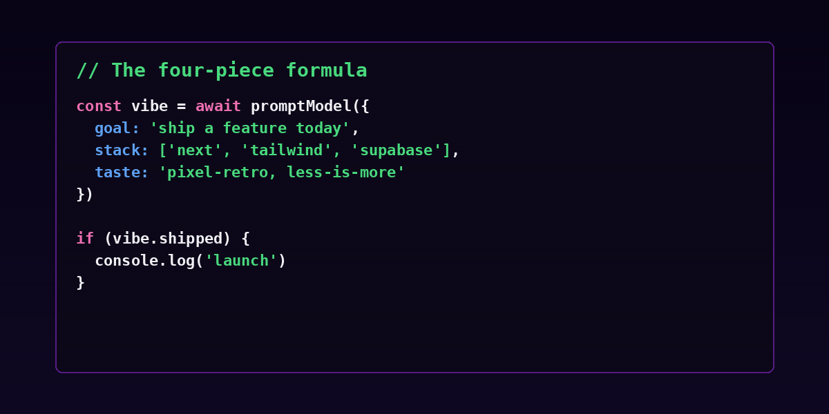
Every v0 prompt that converts has four pieces, in this exact order:
- The one-sentence product description. What it is and what it does. Not what it could do — what it does.
- The audience. Who buys it. Specific roles, not vague segments.
- The visual direction — name a real reference, not an adjective. "Like Linear" beats "modern."
- The sections you want, in order. v0 respects ordering more than any other signal in the prompt.
Leave any one out and you get generic AI slop. Include all four and v0 nails it on attempt one or two roughly 70% of the time.
The rest of this post is the ten prompts I actually use, plus the iteration tricks for the 30% of cases where the first draft needs work.
Why most v0 prompts produce slop
Most v0 prompts fail one of three ways:
- Adjective hell. "Make a modern, clean, beautiful, premium landing page." None of those words describe a design. The model fills in defaults that look like every other landing page from 2024.
- Feature list, no narrative. Listing features ("we have analytics, integrations, AI") gets you bullet-soup. v0 wants a story shape — hero, proof, mechanics, pricing.
- Section soup. Asking for "a hero, features, testimonials, pricing, FAQ, footer, signup form, contact form, blog teaser, and team section" produces a page that scrolls forever and converts no one. Five sections is plenty. Nine is too many.
Fix all three by following the formula and being specific. The prompts below show exactly how.
Ten v0 prompts I actually use
These are the prompt shapes for ten common landing-page jobs. Copy, paste, swap your specifics, ship.
1. SaaS landing with social proof
"A landing page for [product name], a habit-tracking SaaS for busy professionals. Style: calm, minimal, like Linear's homepage. Sections in order: hero with email input, three-column feature grid (Track / Analyze / Share), testimonial carousel, pricing table with three tiers (Free, Pro $19, Team $49), FAQ, footer."
2. Indie product launch page
"A launch-day landing page for [product name], an indie iOS app that helps people journal in 60 seconds. Style: warm, bright, playful — like the Flighty app website. Sections: hero with App Store badge, animated phone mockup placeholder, 'why it exists' section, three press quotes, email capture for launch updates."
3. Developer tool
"A landing page for [product name], an open source CLI tool that deploys serverless functions. Audience: senior backend engineers. Style: dark terminal aesthetic like fly.io. Sections: hero with npm install code block, three-step 'how it works,' GitHub stars badge placeholder, link to docs, footer with Discord and X."4. AI product (consumer)
"A landing page for [product name], an AI copy editor for non-native English writers. Audience: ESL professionals doing knowledge work. Style: clean, trustworthy, like Grammarly but less corporate. Sections: hero with before/after live demo placeholder, three example use cases (email / blog / docs), 'how the model was trained' transparency section, pricing, sign-up form."
5. B2B infrastructure
"A landing page for [product name], a Postgres monitoring service. Audience: backend engineering leads at series A-C startups. Style: serious, data-dense, like Datadog. Sections: hero with dashboard screenshot placeholder, integrations logo strip, customer quote with logo, 'what we monitor' six-item checklist, request-a-demo form."
6. Marketplace
"A landing page for [product name], a marketplace connecting freelance illustrators with indie game studios. Audience: solo game devs. Style: editorial, visual-first, like Dribbble. Sections: hero with portfolio image grid, four-step 'how it works,' featured-illustrator card row, two pricing tiers for studios."
7. Newsletter
"A landing page for [product name], a weekly newsletter about AI tooling for product managers. Style: editorial, calm, like Stratechery. Sections: hero with subscribe field, sample issue preview screenshot, author bio with photo placeholder, past-issue archive grid (six items), one-paragraph FAQ, subscribe footer."
8. Physical product
"A landing page for [product name], a minimalist leather backpack for remote workers. Audience: digital nomads spending 6+ hours a day with their bag. Style: premium, product-photography-forward, like Away Travel. Sections: hero with 3D product shot, four-row specs grid, lifestyle photo carousel placeholder, three review quotes, sticky 'Add to cart $189' CTA."
9. Education / cohort course
"A landing page for [product name], a six-week cohort course teaching product managers how to use AI tools daily. Style: confident, Stanford-Online-ish. Sections: hero with enrollment CTA, week-by-week curriculum (six rows), instructor bio with photo, three testimonial cards, four-question FAQ, application form."
10. Side project demo / showcase
"A landing page for [product name], a side project that generates pixel art from text prompts. Style: retro gaming, CRT scanlines, 8-bit color palette. Sections: hero with live-demo widget placeholder, example gallery grid (eight items), 'made with' tech stack strip (Next.js, Vercel, Replicate, OpenAI), GitHub repo CTA."
Three rules that beat the prompts
The prompts above will get you 70% of the way there. The other 30% comes down to three rules.
Rule 1: Name a reference, not an adjective
"Like Linear" beats "modern." "Like Stratechery" beats "editorial." "Like Datadog" beats "data-dense." The model has a clearer mental model of named references than of adjectives.
If you do not have a reference, pick the closest competitor whose site you respect and use them. The model is not going to copy them — it is going to use them as a center of gravity.
Rule 2: Order the sections explicitly
v0 respects ordering more than any other signal. "Hero, features, testimonials, pricing, FAQ" produces a page in exactly that order. Reorder the list and the page reorders.
This means: write the order you actually want. Not the order that "feels" right.
Rule 3: Ask for fewer sections than you think you need
Five sections is plenty. Nine is too many. The conversion rate of a long landing page is not 2× a short one — it is roughly equal, with the short one usually winning because it forces clearer copy.
If your draft has nine sections, the iteration is "merge the FAQ into the pricing block, drop the team section, drop the press section." Less always converts more.
Iteration moves — the 30% case
When the first draft is close-but-not-right, do not re-prompt from scratch. Iterate.
- "Make the hero shorter." Almost always the first move. Heroes are usually 40% too tall.
- "Replace the carousel with a static grid." Carousels are conversion killers. v0 reaches for them by default; reject.
- "Drop the [section name]." Lop sections that do not pull weight.
- "Use a single CTA color across the page, not three." v0 sometimes goes rainbow. Pull it back.
- "Add screenshot placeholders sized 1200×800 with the caption 'screenshot of [feature].'" Tells the model where you will drop real images.
- "Make the headline shorter — 6 words max." Forces sharper copy.
- "Add a sticky CTA bar at the bottom that appears on scroll." Turns a static page into a conversion-tuned one.
Each of these is a one-line iteration prompt. Stack them. Do not re-prompt from scratch — you lose all the good parts.
The post-v0 workflow
v0 is the start of the page, not the end. The pages we ship to production go through this loop:
- Generate in v0 with the four-piece formula.
- Iterate two or three times in the v0 chat with the moves above.
- Pull the code into the repo —
Add to codebaseor copy/paste into a Next.js project. - Open in Cursor or Claude Code and refactor — see Cursor vs Claude Code — to match the rest of the codebase's conventions.
- Replace placeholder images with real ones. Compress with
sharporsquoosh. - Add the analytics, the SEO meta, the Open Graph image, and the deploy preview.
- Ship.
Total time from prompt to production-deployed: 60-90 minutes for a polished landing page. This is the same workflow we use in the 48-hour SaaS playbook.
Common mistakes
Asking v0 to "make it different from the last one"
The model has no memory across separate generations unless you explicitly include the previous version in context. Asking for "different" without showing the previous version produces random variation, not directed iteration.
Fix: "Here is the previous version. Make these specific changes: [list]."
Putting layout instructions in adjective form
"Bold, clean, modern" gives you whatever the model thinks bold-clean-modern means today. Layout instructions like "two-column hero with text left, image right" produce predictable output.
Asking for things v0 cannot do
v0 is excellent at static UI. It is not excellent at backend logic, database integration, or auth. If your prompt has "and when the user submits, save to my database," strip that — wire it yourself in your editor afterward.
Using copy from the prompt as final copy
The model writes adequate placeholder copy. Always rewrite. The hero headline is the single highest-leverage piece of copy on the page, and 30 seconds of human writing beats 30 minutes of AI iteration.
Not specifying screenshot dimensions
If you say "screenshot here," v0 picks an aspect ratio. If you say "1200×800 screenshot of the dashboard," v0 reserves the right space and you can drop the real image in without re-flowing the page.
FAQ
Is v0.dev free to use?
There is a free tier with limits. Heavier usage runs on Vercel's paid plans. Always check the live pricing — it has shifted.
Can I use v0 output in production?
Yes. The output is your code under your license. Most production landing pages we ship are 80% v0-generated and 20% human-refactored.
How does v0 compare to Bolt.new and Lovable?
v0 is best at static UI and landing pages. Bolt.new is best at full apps with backend. Lovable is best at opinionated polished apps. See the head-to-head comparison for the full breakdown.
What's the right number of v0 iterations before giving up and doing it manually?
Three. If three iterations have not converged on something usable, the prompt is wrong, not the tool. Step back, rewrite the prompt with the four-piece formula, and start fresh.
Can v0 generate copy that converts?
It generates copy that does not embarrass you. It does not generate copy that converts. Always rewrite the headline, subhead, and CTA by hand. Those are the three pieces that move the conversion rate.
What about animations?
v0 will generate basic Framer Motion animations if asked. Subtle is almost always better than dramatic. "Fade in on scroll" produces a polished page; "bounce, then rotate, then slide" produces a circus.
The bottom line
v0 is a power tool when you prompt it like a designer with a brief — and a slot machine when you prompt it like a developer dumping a feature list.
The four-piece formula (product, audience, visual reference, ordered sections) gets you to a usable landing page in 10-30 minutes. The iteration moves get you to a polished one in 30-60. Anyone telling you "AI landing pages are bad" is using AI badly.
For the broader workflow this fits into: Ship a SaaS in 48 hours, The vibe coder's stack 2026, and What is vibe coding.
For weekly AI-tooling coverage, humanai.news. To deploy a personal AI agent in 60 seconds, RapidClaw.